Contents
Objectives
The aim of this lecture is to help you understand
that there exist mathematical functions that describe different distributions
what makes the normal distribution normal and what are its properties
how random fluctuations affect sampling and parameter estimates
the function of the sampling distribution and the standard error
the Central Limit Theorem
With this knowledge you’ll build a solid foundation for understanding all the statistics we will be learning in this programme!
It’s all Greek to me!
Before we start, let’s make clear an important distinction between sample statistics, population parameters, and parameter estimates.
What we really want when we’re analysing data using statistical methods is to know the value of the population parameter(s) of interest. This could be the population mean, or the difference between two populations. The problem is that we can’t directly measure these parameters because it’s not possible to observe the entire population.
What we do instead is collect a sample and observe the sample statistic, such as the sample mean. We then use this sample statistic as an estimate – the best guess – of the value of the population parameter.
To make this distinction clear in notation, we use Greek letters for population parameters, Latin letters for sample statistics, and letters with a hat for population estimates:
- \(\mu\) is the population mean
- \(\hat{x}\) is the sample mean
- \(\hat{\mu}\) is the estimate of the population mean
Same goes for, for example, the standard deviation: \(\sigma\) is the population parameter, \(s\) is the sample statistic, and \(\hat{\sigma}\) is the parameter estimate.
Distributions again
Let’s briefly revisit the general topic of distributions. Numerically speaking, a distribution is the number of observations per each value of a variable. We could ask our sample whether they like cats, dogs, both, or neither and the resulting numbers would be the distribution of the “pet person” variable (or some other name).
Inspecting a variable’s distribution gives information about which values occur more often and which less often.
We can visualise a distribution as the shape formed by the bars of a bar chart/histogram.
df <- tibble(eye_col = sample(c("Brown", "Blue", "Green", "Gray"), 555,
                        replace = T, prob = c(.55, .39, .04, .02)),
             age = rnorm(length(eye_col), 20, .65))

p1 <- df %>%
  ggplot(aes(x = eye_col)) +
  geom_bar(fill = c("skyblue4", "chocolate4", "slategray", "olivedrab"), colour=NA) +
  labs(x = "Eye colour", y = "Count")

p2 <- df %>%
  ggplot(aes(x = age)) +
  geom_histogram() +
  stat_density(aes(y = ..density.. * 80), geom = "line", color = theme_col, lwd = 1) +
  labs(x = "Age (years)", y = "Count")

plot_grid(p1, p2)

Figure 1: Visualising distributions using a bar chart for a discrete variable (eye colour) and a histogram for a continuous variable (age)
Known distributions
As you can imagine, there are all sorts of distributions of various shapes. Some of these shapes can be very accurately described by mathematical functions, or formulae. If there is a formula to draw the line corresponding to the distribution, we say that these distributions are “algebraically tractable”.
Having a formula for a distribution is very convenient because that means, we can derive useful properties of such distributions. For example, we can relatively easily calculate the probability of randomly drawing a number between let’s say 100 and 107 from some distribution. Since statistics is all about probability, you can imagine that this is very handy!
Here are a few examples of mathematical functions that describe known distributions:
df <- tibble(x = seq(0, 10, length.out = 100),
             norm = dnorm(scale(x), sd = .5),
             chi = dchisq(x, df = 2) * 2,
             t = dt(scale(x), 5, .5),
             beta = (dbeta(x / 10, .5, .5) / 4) - .15)

cols <- c("#E69F00", "#56B4E9", "#009E73", "#CC79A7")
df %>%
  ggplot(aes(x = x)) +
  geom_line(aes(y = norm), color = cols[1], lwd = 1) +
  geom_line(aes(y = chi), color = cols[2], lwd = 1) +
  geom_line(aes(y = t), color = cols[3], lwd = 1) +
  geom_line(aes(y = beta), color = cols[4], lwd = 1) +
  labs(x = "x", y = "Density")

Figure 2: Examples from families of known distributions. Yellow - normal distribution; Pink - one of the β-family; Blue - one of the χ2-family; Green - one of the t-family.
We will encounter a few of these distributions along the way to stats enlightenment (t, \(\chi^2\), and F to be precise). But for now, let’s remind ourselves of probably the most important distribution of them all, the normal distribution.
The normal distribution
The normal distribution is fundamental to the kinds of statistics we will be learning and so its crucial that you understand its properties. You may also come across its alternative name, the Gaussian distribution, named after the German mathematician and a notable dead white dude, Carl Friedrich Gauss. Sometimes it’s also referred to as the bell curve due to its symmetrical, bell-like shape but there are other distribution with very similar shapes so maybe let’s not call it that.
Last term we learned about how this distribution arises as a result of additive processes and how this distribution is a function of two parameters: \(\mu\) (mean) and \(\sigma\) (standard deviation). We talked about how changing the mean of the distribution shifts its centre along the x-axis (centring) and how changing the SD determines the spread of the curve (scaling).
Because the normal distribution is symmetrical and bell-shaped, it’s necessarily true that its mean equals its median and its mode.
Now, it’s important to understand that not every symmetrical bell-shaped distribution is normal. To understand what makes a normal distribution normal, we need to understand the concept of area below the curve.
Area below the normal curve
All the functions that draw the various distributions are probability functions, which means that, when plotted on a graph, the y (vertical) coordinate of the curve has to do with probability of observing the corresponding value on the x-axis.1
Because the probability of getting any value whatsoever when sampling from a distribution is 100% (or 1) – in other words, we will get some value though we don’t know what it will be – the combined area below the curve of a probability distribution is always 1.
We know that the normal distribution is symmetrical about its mean and so the area to the left of \(\mu\) will be the same as the area to the right of it: 0.5, or 50%. So if we were to draw a random observation from a normally distributed variable, we would have a 50% chance of getting a value that’s below the average value and a 50% of getting a value that’s larger than that.
Since the normal distribution is algebraically tractable (i.e., there’s a formula for it), we can use maths2 to calculate the are between any two points along the x-axis. This are is always smaller or equal to 1 and will corresponds to the probability of randomly sampling an observation from the distribution whose value lies between these two points.
Now that we know the idea between calculating the probability of a range of values in a given distribution, we are ready to talk about what makes a bell-shaped symmetrical curve normal. The important thing is to understand that it is the particular proportions of the curve that matter, rather than a vague bell-like shape. Take for instance Figure 3 below: Only the left-hand-side curve is normal. The other line, while very similar isn’t a graph of a normal distribution3 (check the code if you don’t believe that they are actually different).
df <- tibble(x = seq(-4, 4, length.out = 100),
             norm = dnorm(x),
             t = dt(x, 6))

p1 <- df %>%
  ggplot(aes(x = x)) +
  geom_line(aes(y = norm), lwd = 1, colour=theme_col) +
  labs(x = "x", y = "Density")
p2 <- df %>%
  ggplot(aes(x = x)) +
  geom_line(aes(y = t), lwd = 1, colour=second_col) +
  labs(x = "x")

plot_grid(p1, p2)

Figure 3: Even though these two curves look very similar, the right-hand side one is not normal because it’s proportions are slightly off
In a normal distribution, it is always true that:
- ∼68.2% of the area below the curve is within ±1 SD from the mean
- ∼95.4% of the area below the curve is within ±2 SD from the mean
- ∼99.7% of the area below the curve is within ±3 SD from the mean
Here is a visualisation of these proportions:
quantiles <- tibble(x1 = -(1:3), x2 = 1:3, y = c(.21, .12, .03))
tibble(x = seq(-4, 4, by = .1), y = dnorm(x, 0, 1)) %>%
  ggplot(aes(x, y)) +
  geom_density(stat = "identity", color = default_col) +
  geom_density(data = ~ subset(.x, x <= quantiles$x1[3]),
               stat = "identity", color = default_col, fill = default_col) +
  geom_density(data = ~ subset(.x, x >= quantiles$x2[3]),
               stat = "identity", color = default_col, fill = default_col) +
  geom_density(data = ~ subset(.x, x >= quantiles$x1[2] & x <= quantiles$x2[2]),
               stat = "identity", color = NA, fill = second_col) +
  geom_density(data = ~ subset(.x, x >= quantiles$x1[1] & x <= quantiles$x2[1]),
               stat = "identity", color = NA, fill = theme_col) +
  geom_segment(data = quantiles,
               aes(x = x1, xend = x2, y = y, yend = y),
               arrow = arrow(length = unit(0.2, "cm"), angle = 15,
                             type = "closed", ends = "both"),
               color = c(bg_col, default_col, default_col)) +
  geom_line(data = tibble(x = rep(c(-1, 1), 2), y = rep(c(.12, .03), each = 2)),
            aes(x, y, group = y), color = bg_col) +
  geom_line(data = tibble(x = rep(c(-(2:3), 2:3), each = 2),
                          y = as.vector(rbind(0, rep(quantiles$y[-1] + .005, 2)))),
            aes(x, y, group = x), lty = 2, color = default_col) +
  annotate("text", x = rep(0, 3), y = quantiles$y + .05,
           label = c("68.2%", "95.4%", "99.7%"), color = bg_col) +
  labs(x = "z-score", y = "Density") +
  scale_x_continuous(breaks = -4:4)

Figure 4: Proportions of area below the normal curve with respect to multiples of σ on either side of the mean
The R know-how box below shows you how to get the proportion of the area below the normal curve between \(\mu−1\sigma\)and \(\mu+1\sigma\).
Do check it out!
We don’t have to do the maths by hand or even know how it’s done really because R comes with functions that do the numbers for us.
The pnorm() function (probability for a normal variable) tells us the area below the curve from the left-hand-side end of the distribution to any value we choose:
lower <- pnorm(q = -1,  # -1 sigma from the mean
      mean = 0, # set the mu of the distribution
      sd = 1) # set the sigma of the distribution
lower
[1] 0.1586553This tells us that the probability of getting a value between \(-\infty\) and \(-1\) in a normal distribution with \(\mu=0\) and \(\sigma=1\) is 0.16.
Next step is to get the probability of getting a value between \(-\infty\) and 1:
higher <- pnorm(q = 1, mean = 0, sd = 1) # +1 sigma from the mean
higher
[1] 0.8413447Finally, to get the probability of getting a value between −1 and 1, we simply need to subtract the smaller value from the larger:
higher - lower
[1] 0.6826895There we have it – the probability is about 0.68, just as promised!
We can calculate (or let R do it for us) the proportion of the area under the curve for any multiple of SD from the mean of the distribution, or even between any two points along the x-axis.
Conversely, we can reverse the maths to get the value along the x-axis that cuts the distribution into pieces of any proportion. We already learnt that drawing a vertical line down the normal distribution at its mean (e.g., zero SD from the mean) will cut it into lower half and upper half. If we drew this line at \(\mu-1\times\sigma\), we would be cutting the distribution into lower/left 15.87% and upper/right 84.13%.
Pause to think!
What is the relationship between these particular proportions (15.87% and 84.13%) and the 68.2% of the area that lies within \(\mu\pm1\times\sigma\) in the normal distribution?
Figuring out relationships between things is an important skill so hone it and don’t skip this exercise!
We can apply the same kind of maths to “chop off” extreme values in a distribution, that is those values that we wouldn’t expect to observe often. Let’s say we want to know the number of _SD_s from the mean beyond which lie the outer 5% of the distribution. Plugging in the numbers, we get around \(\mu\pm1.96\times\sigma\). We can visualise this area like this:
quantiles <- qnorm(.025) * c(-1, 1)
tibble(x = sort(c(quantiles, seq(-4, 4, by = .1))), y = dnorm(x, 0, 1)) %>%
  ggplot(aes(x, y)) +
  geom_line(color = default_col) +
  geom_density(data = ~ subset(.x, x >= quantiles[1]),
               stat = "identity", color = NA, fill = second_col) +
  geom_density(data = ~ subset(.x, x <= quantiles[2]),
               stat = "identity", color = NA, fill = second_col) +
  geom_line(data = tibble(x = rep(quantiles, each = 2),
                          y = c(0, .15, 0, .15)),
            aes(x, y, group = x), lty = 2, color = default_col) +
  geom_segment(data = tibble(x = quantiles, xend = c(4, -4),
                             y = c(.15, .15), yend = c(.15, .15)),
               aes(x = x, xend = xend, y = y, yend = yend),
               arrow = arrow(length = unit(0.2, "cm"),
                             angle = 15, type = "closed"),
               color = default_col) +
  annotate("text", x = c(-2.8, 2.8), y = .18,
           label = ("2.5%"), color = default_col) +
  labs(x = "z-score", y = "Density")

Figure 5: The extreme 5% of the normal distribution (2.5% in the left tale and 2.5% in the right tail) lies outside of ±1.96 SD from the mean
Of course, R has useful built-in functions for calculating these critical values for all the standard distributions too! To get the cut-off for a given probability in the normal distribution, use the qnorm() (quantile of the normal distribution) function, which is kind of the inverse of the pnorm() function discussed in the R know-how box above:
qnorm(p = .025,  # probaility corresponding to the lower 2.5% cut-off
      mean = 0, # set the mu of the distribution
      sd = 1) # set the sigma of the distribution
[1] -1.959964# upper 2.5% cut-off (97.5% counting from the left-hand-side)
qnorm(p = .975, mean = 0, sd = 1)
[1] 1.959964Critical values
The principles explained above mean that, if we have a variable that can be reasonably assumed to be normally distributed and if we know its SD, we can calculate these cut-off point (critical value) for any proportion of our data. This is very useful for specifying the criteria for what we consider outliers in out data.
For example, we could say that the most extreme 3% of our data should be considered outliers and removed from our dataset. If we can assume that our data come from a normally distributed population, we can use our sample mean and SD to calculate the critical value that cuts off 1.5% from either tail of the distribution.
Let’s say we asked a sample of people how many grammes of chocolate they eat per week. Let’s also assume that the underlying variable is normal. We looked at the descriptive statistic of the variable and found that the mean grammes consumed is 53.7 with SD = 17.6.
The critical values that cut off bottom and top 1.5% of a normal distribution with a mean of 0 and SD of 1 (AKA the standard normal distribution) are about −2.17 and 2.17, respectively. Multiplying each of these numbers by the SD of our variable, gives us the number of grammes from the mean of the distribution that should be our cut-offs for outliers: ±38.19. That means that we can expect 3% of the population from which we sampled our data to have values smaller than 15.51 and larger than 91.89.
In other words, under our 3% criterion for outliers, we can consider anyone who eats less than 15.51 or more than 91.89 grammes of chocolate per week an outlier (see the R know-how box below for a quick way of getting these numbers).
qnorm(p = .015, mean = 53.7, sd = 17.6) # lowest 1.5%
[1] 15.50641qnorm(p = .985, mean = 53.7, sd = 17.6) # highest 1.5%
[1] 91.89359Bear in mind that these critical values represent multiples of SD and so to express the cut-off points in term of values in the given variable, you need to multiply them by SD.
Alternatively, you can z-transform your variable so that its SD is 1 and then you don’t have to worry about the multiplication. That’s exactly why we’ve been using z-scores in our plot: they simply make things easier…
It’s REALLY important to understand that these critical values are characteristic of the normal distribution. Other distributions have different critical values but the principle is the same.
Test your understanding
Understanding these building blocks of statistics will make learning the rest much easier so make sure you can confidently and correctly answer the following questions before you move on. Feel free to useR to find out the answers.
QUESTION 1
What proportion of the area under the curve of the standard normal distribution lies outside of ±2 SD from the mean?
Give answer to 1 decimal place without the % sign, such as 58.3
4.6
Correct!That’s not right…
QUESTION 2
In a normal distribution with a mean of 50 and a SD of 17.5, what value is the cut-off for the bottom 30% of the distribution?
Give answer to 2 decimal places.
40.82
Correct!That’s not right…
QUESTION 3
In our chocolate example from earlier, what z-score cuts off the top 1.5% of the distribution?
Give answer to 2 decimal places.
2.17
Correct!That’s not right…
QUESTION 4
Assuming IQ is a normally distributed variable with a mean of 100 and a SD of 15, what percentage of people can be expected to have an IQ or 120 or more?
Give answer to 2 decimal places without the % sign, such as 10.85.
9.12
Correct!That’s not right…
QUESTION 5
A researcher collected personality data from sample of 200 people. Based on previous research, she is assuming that extraversion is a normally distributed variable. She decided to exclude any participants whose extraversion scores are further than 2 SD from the mean.
How many participants can the researcher expect to have to exclude?
Give answer to 0 decimal places.
9
Correct!That’s not right…
Now that we have a solid understanding of the normal distribution, the area below its curve and of the concept of critical values, we can move on to talking about population parameter estimates. To get there, we first need to revisit a few topics.
Sampling from distributions
As you will recall, when we collect data from participants on some variable, we are assuming that individual observations are sampled randomly from the population. Remember that the term population does not necessarily refer to people. Population is the set of all observations of a given variable.
When it comes to the kind of things we investigate as psychologists using quantitative research, such as traits, abilities, or attitudes, many – though certainly not all – are assumed to come from a normal distribution.
Let’s mention just a few instances where the normal distribution is not a reasonable assumption: Reaction times tend to be reasonably well described by the log-normal distribution, similar to the distribution of wealth we discussed last term. Passes and fails on an exam are distributed according to the binomial binomial distribution, while the number of calls to a call centre within a minute follow the Poisson distribution. The point of these examples is to illustrate that, though distributions are idealised mathematical forms, they can be used to model things in the real world. Every time we’re collecting data on real-life variables, we are essentially sampling from these distributions.
Naturally, any two samples are very likely to be different from one another, even if they originate from the same population. Two bags of Skittles from the same factory will most likely have different distribution of colours because they are produced at random.4
The same is the case with any other variable. We can easily demonstrate this by simulating drawing two samples from the same population in R:
As you can see, the numbers in the respective samples are not the same.
Because the values of the observations aren’t the same, the statistics calculated based on two samples will also differ. To illustrate this, let’s ask R to draw two samples of 50 observations each from a normal distribution with mean of 100 and SD of 15 and calculate the means of both of these samples.
So the means (\(\bar{x}\)) of our two samples are not equal. What’s also important to understand is that these statistics also very likely to differ from the from the population parameter (e.g., \(\mu\)). In each case, however, the sample mean is our best estimate of the population mean.
While simulation allows us to, in a way, create a world and set its parameters to whatever we like – in the example above we set them to \(\mu=100\) and \(\sigma=15\) – in real life we do not know the value of the true population parameters. That is, after all, why we estimate them from samples!
p1 <- ggplot(NULL, aes(x = sample1)) +
  geom_histogram(bins = 15) +
  geom_vline(xintercept = mean(sample1), color = second_col, lwd = 1) +
  labs(x = "x", y = "Frequency") + ylim(0, 8)
p2 <- ggplot(NULL, aes(x = sample2)) +
  geom_histogram(bins = 15) +
  geom_vline(xintercept = mean(sample2), color = second_col, lwd = 1) +
  labs(x = "x", y = "") + ylim(0, 8)
plot_grid(p1, p2)

Figure 6: Two samples from the same population differ both in their distributions and, as a result, in their sample statistics, in this case their means (vertical lines).
Sampling distribution
Let’s briefly recap what we learnt about the sampling distribution last term and set it in the context of estimating parameters.
Because we know that the mean (or any other statistic) calculated using our sample is just one of the possible ones and it depends solely on the particular characteristics of the sample, we know that there exists an entire “universe” (or population!) of sample means and the mean we got in our sample represents just one observation of this universe. If we took all possible samples of a given size (let’s say N = 50) from the same population and each time calculated \(\bar{x}\), the means would have their own distribution. This is the sampling distribution of the mean.
Each of these hypothetical sample means can be used as estimates of the population mean – the one true mean of the entire population. Sadly, we can never know its value but we know it exists. We also know that its value is identical to the mean of the sampling distribution. Sadly (there’s a lot of sadness in stats!), we will never observe the entire sampling distribution either as it would require getting all possible samples of a given size from the same population.
But just because we can’t observe the sampling distribution, it doesn’t mean that we don’t know anything about it. In fact, we know its key properties: Its mean is equal to the value of the population parameter and it’s standard deviation, called the standard error, is related to the population standard deviation \(\sigma\) and sample size \(N\):
\[SE = \frac{\sigma}{\sqrt{N}}\]
Now, we don’t know the value of σ for the same reason we don’t know the value of \(\mu\) but we can estimate the standard error from sample standard deviation, \(s\) as:
\[\widehat{SE} = \frac{s}{\sqrt{N}}\]
To illustrate what a sampling distribution may look like, let’s simulate one in R!
Imagine we went and bought a big bag of 20 apples.
Each apple has its weight. Let’s assume, that the weights are distributed normally and that the population mean \(\mu\) is 173g with a \(\sigma\).
The benefit of simulation is that we can just decide what our population parameters are while, in reality, these values are, and will ever, be unknown.
We calculate the mean weight of our sample, knowing that it will be just one possible sample means and it will most likely differ from \(\mu\).
Now, imagine we spent the rest of our days going round buying bags of 20 apples until we got 100,000 of them, calculating the sample mean of each bag. Because all these means are based on samples from the same population and of the same size, they come from the same sampling distribution of the mean. We still don’t have the entire distribution but with 100k means, we have a reasonably good approximation.
Here’s how we can code this simulation:
- we draw 20 observation form the population using rnorm()
- we calculate the mean of this sample with mean()
- we repeat this procedure 100,000 times using replicate() saving all the means of all the samples in an object called x_bar.
Here’s the distribution of our 100k means visualised:
ggplot(NULL, aes(x_bar)) +
  geom_histogram(bins = 51) +
  geom_vline(xintercept = mean(x_bar), col = second_col, lwd = 1) +
  labs(x = "Sample mean", y = "Frequency")

Figure 7: Approximation of the sampling distribution of the mean from the example population based on 100,000 simulated samples. Vertical line represents the mean of the distribution.
Notice, that the mean of our “sampling distribution”, 172.99 is pretty close to the population mean, we decided ahead of our simulation (173). If we had the entire sampling distribution, its mean would be actually identical to \(\mu\)!
Standard error
You already know what the standard error is so this will be quick.
Standard error is simply the SD of the sampling distribution. In our simulation example, the distribution of 100k sample means of apple weights had a SD of 5.144. This is very close to the actual SE calculated using the formula:
\[\begin{aligned}SE &= \frac{\sigma}{\sqrt{N}}\\ &= \frac{23}{\sqrt{20}}\\ &\approx 5.1429563\end{aligned}\]
As we said above, we don’t really have access to the entire sampling distribution (not even the miserly 100k samples!) or the population parameters and so we have to estimate SE using the standard deviation of our actual sample.
Let’s use R to draw a single sample (N=20) from our population of apples and estimate the value of SE on the basis of it:
As you can see, our \(\widehat{SE}\) of 4.894 is a bit of an overestimate compared to the actual \(SE\) of 5.143. That’s just what happens with estimates, they’re often close but almost never precise.
OK, so what is the standard error actually for? What does it tell us?
The standard error allows us to gauge the resampling accuracy of parameter estimate (e.g., \(\hat{\mu}\)) from our sample.
A relatively large SE means that we can expect the estimate based on a different sample to be rather different from the one we got in our actual sample. Conversely, a relatively small SE gives us a reason to expect individual sample statistics (and thus parameter estimates) to vary little from sample to sample.
The smaller the SE, the more confident we can be that the parameter estimate (\(\hat{\mu}\)) in our sample is close to those in other samples of the same size.
Now, because SE is calculated using N, there is a relationship between the two:

Figure 8: Magnitude of SE is a function of sample size: Given a constant SD, SE gets smaller as N gets larger
That is why larger samples are more reliable!
Understanding sampling distributions and their properties prepares the ground for exploring a key principle in statistics…
The Central Limit Theorem
This core principle in statistics is named “central” because of how important it is to statistics but, once you understand the sampling distribution, it’s really rather simple. It’s actually the simplicity that makes its importance so impressive.
The Central Limit Theorem states that the sampling distribution of the mean is approximately normal regardless of the shape of the population distribution!
The CLT only applies to the sampling distribution of the mean, not other parameters!
By approximately normal we mean that as the sample size that characterises the sampling distribution get larger, the shape of the sampling distribution approaches normal. That’s pretty much all there is to the Central Limit Theorem so make sure you understand these two statements.
Actually, we already demonstrated the CLT last term, though we didn’t refer to it by its name.
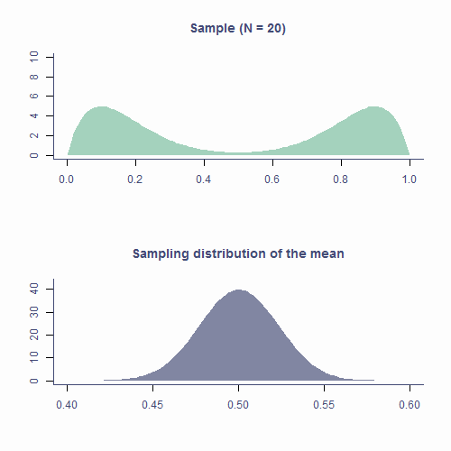
Let’s see how the CLT applies to the sampling distribution of estimates of the mean based on samples form a non-normal population. In the top plot of animation below, we repeatedly draw samples of N = 20. The green area is the underlying distribution of the population and, as you can see, it’s resolutely not normal.
Every time we pick a sample, we calculate it’s mean and plot it on a histogram in the bottom panel. The blueish shape is the sampling distribution of the mean based on N = 20 so that’s the shape we’re expecting to eventually get.
As you can see that’s kind of the shape our histogram of sample means forms. It’s not exactly the same because we are drawing a relatively small number of samples (about 10k) but if we were to continue, the shape would get smoother.
Approximately normal
OK, so that’s one of the parts of the CLT – the sampling distribution of the mean will be normal even if the underlying population distribution is not. But what about “approximately” normal? How does that work.
To see this, let’s simulate sampling distributions (100k means) from the same population based on N = 5, N = 30, and N = 1,000 and plot them on histograms:
par(mfrow=c(2, 2), mar = c(3.1, 4.1, 3.1, 2.1), cex.main = 2)
pop <- tibble(x = runif(100000, 0, 1)) %>%
  ggplot(aes(x)) +
  geom_histogram(bins = 25) +
  geom_vline(aes(xintercept = mean(x)), lwd = 1, color = second_col) +
  labs(title = "Population", x = "", y = "Frequency")

plots <- list()
n <- c(5, 30, 1000)
ylab <- c("", "Frequency", "")
for (i in 1:3) {
plot_tib <- tibble(x = replicate(1000, mean(runif(n[i], 0, 1))))
plots[[i]] <- ggplot(plot_tib, aes(x)) +
  geom_histogram(aes(y = ..density..), bins = 30) +
  labs(title = bquote(paste(
    italic(N)==.(n[i]),
    "; ",
    italic(SE)==.(round(sd(plot_tib$x), 2)))),
    x = "", y = ylab[i]) +
  # xlim(0:1) +
  stat_density(geom = "line", color = second_col, lwd = 1)
}

plot_grid(pop, plots[[1]], plots[[2]], plots[[3]])

Notice that, as N gets larger, the sampling distribution of \(\mu\) tends towards a normal distribution with mean = \(\mu\) and \(SD=\frac{\sigma}{\sqrt{N}}\).
If we disregard the word “approximately” for a wee bit, and say that the sampling distribution of the mean is normal, we’ll realise that everything that applies to the normal distribution applies to the sampling distribution of the mean: ~68.2% of means of samples of size 50 from this population will be within ±5.14 of the true mean. And if ~68.2% of sample means lie within ±5.41, then there’s a ~68.2% probability that \(\bar{x}\) will be within ±5.41 of \(\mu\)!
The last paragraph takes a while to wrap ones head around so spend some time on it.
Test your understanding
Answer the following questions given the parameters we chose for the simulation in our apple example (\(\mu=173\) and \(\sigma=23\)).QUESTION 6
What is the mean of the sampling distribution of the mean apple weight if the sample size is 20?
Give answer to 2 decimal places.
173.00
Correct!That’s not right…
QUESTION 7
How about if the sample size is 50?
Give answer to 2 decimal places.
173.00
Correct!That’s not right…
QUESTION 8
What is the range of sample means we can expect to get 95% of the time if we were to sample a bag of 20 apples?
Give answer to 2 decimal places as a range, such as 100.24-250.96
162.92-183.08
Correct!That’s not right…
QUESTION 9
What is the range if the sample size is 50 apples?
Give answer to 2 decimal places as a range, such as 100.24-250.96
166.62-179.38
Correct!That’s not right…
QUESTION 10
What is the SE of the mean in the population of apple weights for samples of size 100?
Give answer to 2 decimal places.
2.30
Correct!That’s not right…
As a matter of convention, in practice, we tend to assume that the sampling distribution is normal when the sample size is larger than 30. We will talk about the reason for this next time but for now, that’s plenty…
Take-home message
Distribution is the number of observations per each value of a variable
There are many mathematically well-described distributions
- Normal (Gaussian) distribution is one of them
Each has a formula allowing the calculation of the probability of drawing an arbitrary range of values
Normal distribution is
- continuous
- unimodal
- symmetrical
- bell-shaped
- it’s the right proportions that make a distribution normal!
In a normal distribution it is true that
- ∼68.2% of the data is within ±1 SD from the mean
- ∼95.4% of the data is within ±2 SD from the mean
- ∼99.7% of the data is within ±3 SD from the mean
Every known distribution has its own critical values
Statistics of random samples differ from parameters of a population
Distribution of sample parameters is the sampling distribution
Standard error of a parameter estimate is the SD of its sampling distribution
- Provides_ margin of error_ for estimated parameter
- The larger the sample, the less the estimate varies from sample to sample
Central Limit Theorem
- Really important!
- With increasing sample size, the sampling distribution of the mean tends to – or approximates – normal even if population distribution is not normal
Understanding distributions, sampling distributions, standard errors, and CLT it most of what you need to understand all the stats techniques we will cover.
This relationship is not straight-forward but let’s not worry about that too much.]↩︎
The area of mathematics that deals with calculating the are below a curve is called integral calculus.↩︎
It’s a graph of a t-distribution with 4 degrees of freedom but as for what that means, you’ll have to wait till Lecture 2. :)↩︎
Admittedly, this is an assumption. It is possible that the company who makes Skittles uses the slave labour of an army of Cinderellas who sort the individual pieces of candy into bags. We can neither confirm nor deny this.↩︎