Introduction
When people first encounter linear models with categorical variables, they often find them unintuitive and struggle to make sense of the model output. The need to specify contrasts just further deepens the confusion: What even are contrasts? What are they for? What do they actually mean?
If you’ve grappled with any of these issues and still don’t feel like you completely “get it”, this tutorial is for you. We will start by revisiting the linear model with a single continuous predictor to talk about model coefficients (\(b\)s). Then we’ll look at why we cannot treat categorical predictors the same way we do continuous once and explain the need for dummy coding. Next we will see how, despite working with categories, the interpretation of the model coefficients stays the same. Finally we will delve into contrasts to answer all the questions we asked in the previous paragraph. We will learn how to make our own contrasts and understand how they affect model coefficients and determine the interpretation of the model output.
Let’s dive in!
Linear model revisited
As you probably already know, the linear model with a single continuous predictor is basically an equation for a line:
\(\hat{y}_i = b_0 + b_1\times x_{1i}\),1
where
- \(x_1\) is the predictor variable in our model (in experimental design, it is called the independent variable)
- \(\hat{y}\) is the value of the outcome variable (dependent variable in experimental design) that our model predicts for any given value of \(x_1\)
- \(b_0\) is the intercept of the line, i.e., the value of \(\hat{y}\) when \(x\) is zero.
- \(b_1\) is the slope or gradient of the line that determines how steep the line is and whether it goes up or down
- \(i\) is the index that indicates which observation in the data we are talking about and can be anything between 1 and N, where N is the sample size.
Example
To demonstrate how the model really is just a line, let’s simulate a dataset and fit a linear model to it.
lm_data <- tibble::tibble(
  # predictor: 100 observations sampled from the normal distribution
  # with mean of 100 and a standard deviation of 15
  x = rnorm(100, mean = 100, sd = 15),
  # outcome is linearly related to x
  y = -50 + 2.4 * x
)

# show first few rows
head(lm_data)
# A tibble: 6 x 2
      x     y
  <dbl> <dbl>
1  91.6  170.
2  96.5  182.
3 123.   246.
4 101.   193.
5 102.   195.
6 126.   252.
Notice how the y variable was created using the linear equation, with \(b_0 = -50\) and \(b_1 = 2.4\).
Let’s see what the relationship between these two variables looks like on a scatter plot.
lm_data %>%
  ggplot(aes(x = x, y = y)) +
  geom_point(alpha = .3)
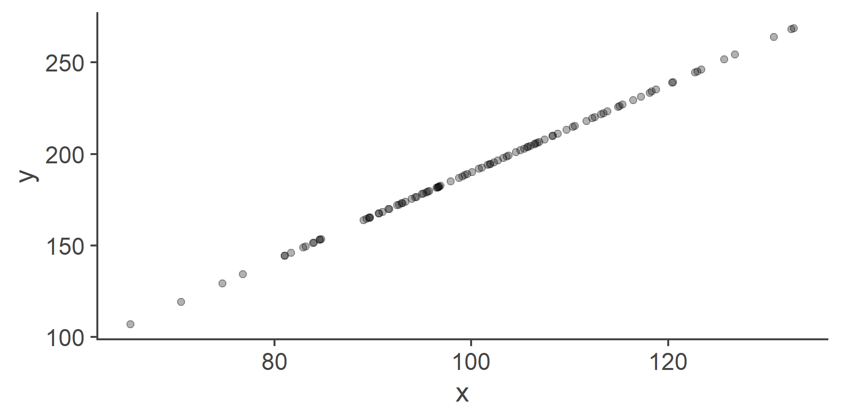
Figure 1: A perfect linear relationship between two variables
Because we created y as a perfect linear combination of x, the two plotted against each other form a straight line.
This kind of a perfect relationship is not realistic so let’s add some random noise into the mix:
lm_data <- lm_data %>%
  dplyr::mutate(
    # to each observation of y, add a random value
    y = y + rnorm(100, mean = 0, sd = 30)
  )


lm_data %>%
  ggplot(aes(x = x, y = y)) +
  geom_smooth(method = "lm", se = FALSE, colour = "orangered") +
  geom_point(alpha = .3)
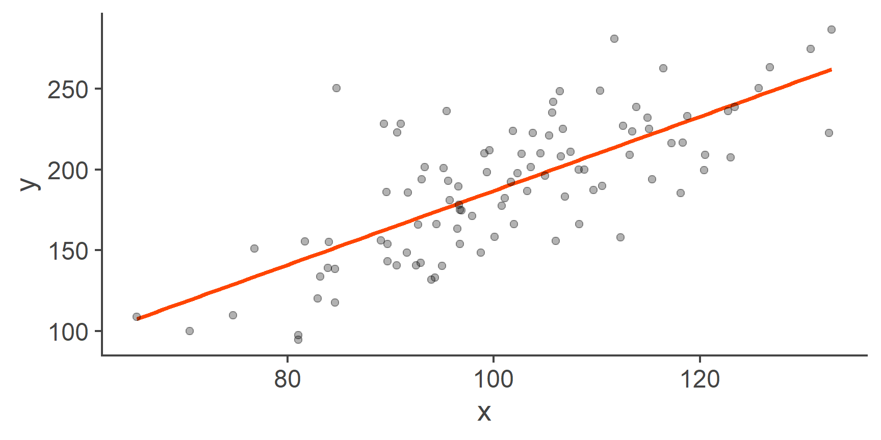
Figure 2: Scatterplot of y by x with a line of best fit
That’s more like it!
The orange line represents the linear model: it’s the line of best fit. Because it’s a line, it has an intercept and a slope. The main point of fitting, evaluating, and interpreting the linear model is to find the values of these coefficients.
Normal residuals
The data we just generated are ideal for fitting a linear model to.
- We know the relationship is linear because we created
yas a linear combination ofx. - We also know that residuals are normally distributed because we created them using the
rnorm()(random normal). - Finally, we know that the residuals have equal variances across the range of
xbecause we set the variance ourself as a single value given to thernorm():sd = 30(remember that \(SD = \sqrt{var(x)}\))
Now that we have our data, we can go ahead and fit the linear model:
m1 <- lm(y ~ x, lm_data)

m1
Call:
lm(formula = y ~ x, data = lm_data)

Coefficients:
(Intercept)            x
    -42.590        2.295
This super basic printout of the m1 object that contains the model information gives us the intercept (\(b_0\)) and the slope (\(b_1\)) associated with our only predictor x.
Based on these two values, we know that:
- When the value of
xis zero, our model predicts the value ofyto be -42.6 units. - With each 1-point increase in
x,yincreases by 2.3 units.
Look at the line representing the model to see that these values check out.
Notice that the values of the model coefficients are very similar to the values we used to generate y.
The only reason why they are not the same is the random noise we added to the data.
QUESTION 1
What value of the outcome variable does our model predict for someone whose value of the predictor is 130? Round the answer to 1 decimal place.
255.8
Correct!That’s not right…
QUESTION 2
What is the difference in y between someone who has a value of x = 100 and someone who has a value of x = 120 (round to 1 dp).
45.9
Correct!That’s not right…
Continuous vs categorical predictos
So what changes when, instead of a continuous predictor, we add a categorical one? Why can’t we just do the same thing and fit a normal model?
Well, let’s try:
cat_data <- tibble::tibble(
  # repeat numbers 1-4, each one 25 times
  x = rep(1:4, each = 25),
  y = 84 - 15 * x + rnorm(100, mean = 0, sd = 22)
)

cat_data %>%
  ggplot(aes(x = x, y = y)) +
  geom_smooth(method = "lm", se = FALSE, colour = "orangered") +
  geom_point(alpha = .3)
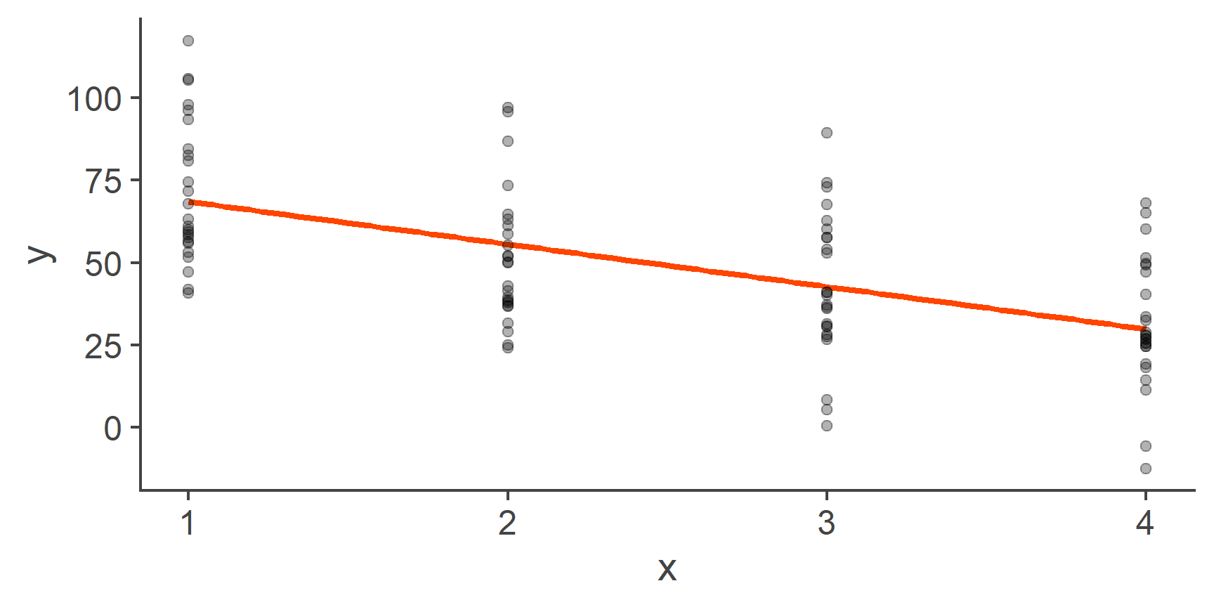
Figure 3: Fitting a line through categorical data
On the face value, this looks fine, the relationship is normal, the residuals look normal and homoscedastic. So what’s the problem?
Well, the problem is that labelling the levels of our categorical variable 1, 2, 3, and 4, respectively, was a completely arbitrary choice. Categorical variables, such as first language, programme of study, or gender do not have an intrinsic ordering and so the levels could just as well be 4, 3, 2, 1 or 3, 2, 4, 1 or any other combination. Each of these would result in a drastically different line of best fit:
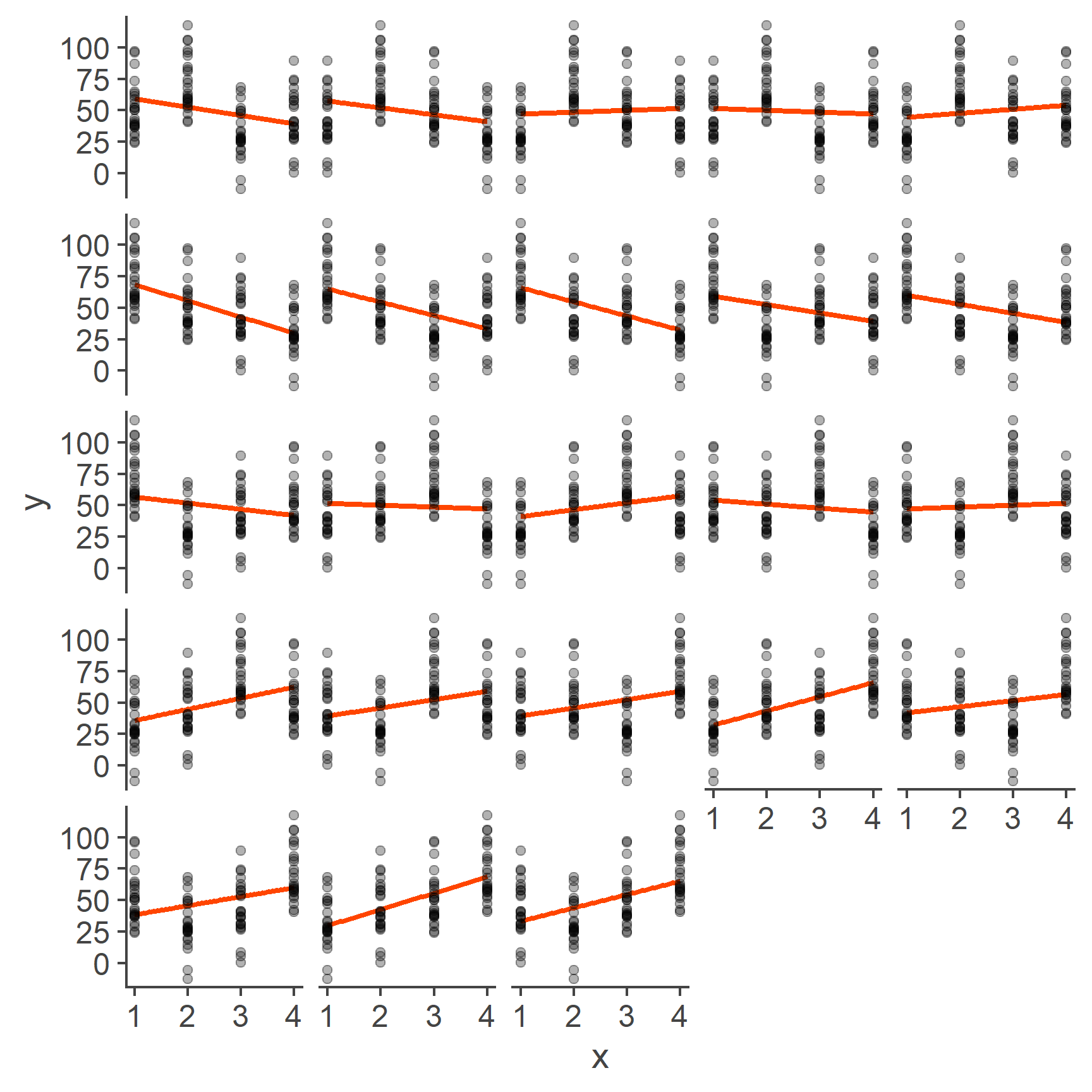
Figure 4: Models based on all possible codings of 4 categories
As you can see, each one of these lines is different. Having a model that is dependent on arbitrary labelling choices is a big problem and it’s exactly the reason why we cannot treat a categorical variable as continuous.
Linear model with categorical predictor
One (but not the only) way around the problem illustrated above is to treat a single categorical variable as several binary variables. Binary variables, while still categorical, do not have the ordering problem. Yes, you can say that you still have two ways of ordering them depending on which one of the two levels is coded as 0 and which one as 1, but the two resulting slopes will only differ in sign, not in magnitude.
To show that this is true, let’s add two binary variables, x_bin1 and x_bin2 to our data.
They represent the same categories, just coded in reverse.
So if one has a value of 1, the other will have a value of 0:
We can now fit two models, each predicting y by one of these variables respectively, and compare their slopes:
Just as promised, the slopes of the two models only differ in sign.
You will have noticed2 that the intercepts differ quite a lot. To understand why, we need to talk about what the coefficients mean if the predictor is a binary category.
Coefficients in models with a single binary predictor
As you know, in linear regression, the intercept is the value of outcome when the predictor is zero and the slope is the change in the outcome as a result of a unit change in the predictor.
This is also true in the case of a binary predictor but what do these things actually mean?
To get some insight into this, let’s plot one of our binary variables against the outcome y:
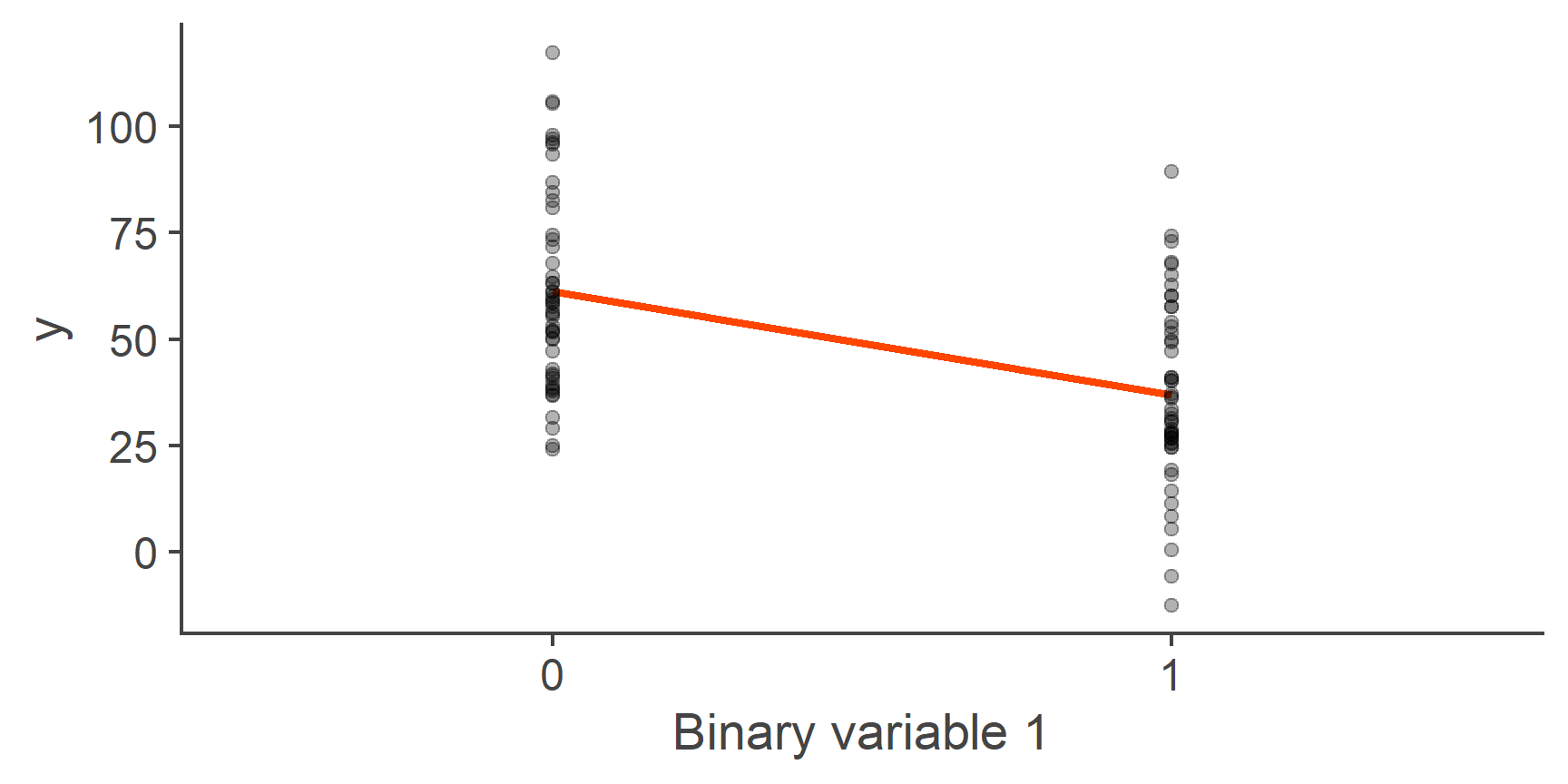
Figure 5: Linear model with a binary predictor
You can see in the plot above that this is just a normal linear model just with one additional restriction: Only values 0 and 1 for the predictor make sense and so only the predicted values for these two points are informative. With that in mind, let’s interpret our model coefficients.
Just as in a normal model, the intercept is the predicted value of outcome when predictor is zero and the slope is the change in the outcome associated with a single unit change in the predictor.
QUESTION 3
What does our predictor value of 0 represent?
First (reference) group
Correct!That’s not right…
QUESTION 4
What is the predicted value of y for given group?
Predicted mean of y in that group
Correct!That’s not right…
QUESTION 5
What does the unit change in x represent?
Shift from the first group to the second group
Correct!That’s not right…
QUESTION 6
Given all the above, what does the slope of the line represent?
Difference in predicted means of y between the first and second group
Correct!That’s not right…
Looking at the plot, it should be clear that the line of best fit goes through the mean of y within each of the two groups, with the intercept equal to the predicted mean of the group coded as 0 and slope equal to the difference in means of y between these two groups.
This is also apparent if you substitute for the value of \(x\) in the linear model equation:
\[\begin{aligned}\hat{y}_i &= b_0 + b_{1}\times x_{1i}\\ \hat{y}_{\text{group }0} &= b_0 + b_{1}\times 0\\ &=b_0\\ \hat{y}_{\text{group }1} &= b_0 + b_{1}\times 1\\ &= b_0 + b_{1}\end{aligned}\]
Therefore
\[\begin{aligned}\hat{y}_{\text{group }0} - \hat{y}_{\text{group }1} &= b_0 - b_0 + b_{1}\\ &= b_1\end{aligned}\]
QUESTION 7
What is the predicted mean of the group coded as 0 (round to 1dp)?
61.3
Correct!That’s not right…
QUESTION 8
What is the predicted mean of the group coded as 1 (1dp)?
37
Correct!That’s not right…
Compare the predicted mean of the group coded 1 that you just calculated to the intercept of our second binary model. Remember, the two models are the same, just the variable is coded in reverse!
(Intercept)      x_bin2
   36.98792    24.32463
Since the coding is reversed, the intercept now gives us the predicted mean of y in the group that was previously coded as 1.
You can also see that the sign associated with the slope is indicative of which group is larger because the difference is always calculated as Groupn − Groupn+1. If the value is positive, is means that the first group has a larger predicted mean of the outcome because subtracting a smaller number from a larger one results in a positive number. If it is negative, it means that the second group has the larger mean of the two.
Categorical variables with more than two levels
Now that we understand what the model coefficients mean when the predictor is binary, let’s go back to the scenario where we had a predictor variable that represented more than two groups:

Figure 6: Fitting a line through categorical data (repeat)
We said earlier that one way to treat this kind of a variable is to split it into a series of binary variables.
To sufficiently do this for our 4-level variable x, we need 3 dummy variables:
- First binary variable will have a value of 1 for everyone in the second group and 0s elsewhere. It will be the indicator of the second group.
- Second binary variable will have a value of 1 for everyone in the third group and 0s elsewhere It will indicate the third group.
- First binary variable will have a value of 1 for everyone in the fourth group and 0s elsewhere. It will be the indicator of the fourth group.
We do not need a separate indicator for the first (reference) group because that group is unambiguously indicated if all the three variables are equal to 0. Here is what the coding table looks like:
| x | D1 | D2 | D3 |
|---|---|---|---|
| 1 | 0 | 0 | 0 |
| 2 | 1 | 0 | 0 |
| 3 | 0 | 1 | 0 |
| 4 | 0 | 0 | 1 |
Once we have these three variables, we put them in the model instead of the original categorical predictor.
That means, that our model predicting y by our categorical x is not in fact
\[\hat{y}_i = b_0 + b_1\times x_{1i}\] but
\[\hat{y}_i = b_0 + b_1\times D_{1i}+ b_2\times D_{2i} + b_3\times D_{3i}\] These three dummy variables are mutually exclusive: You can either score 1 on D1, or D2, or D3, or neither but never on more than only one of them.
Here is what a selection of our data looks like once we add the dummy variables:
cat_data <- cat_data %>%
  mutate(D1 = as.numeric(x == 2),
         D2 = as.numeric(x == 3),
         D3 = as.numeric(x == 4))

cat_data[c(1:3, 26:28, 51:53, 76:78), ]
# A tibble: 12 x 5
       x     y    D1    D2    D3
   <int> <dbl> <dbl> <dbl> <dbl>
 1     1 117.      0     0     0
 2     1  97.9     0     0     0
 3     1  63.2     0     0     0
 4     2  55.3     1     0     0
 5     2  38.5     1     0     0
 6     2  38.2     1     0     0
 7     3  30.7     0     1     0
 8     3  26.6     0     1     0
 9     3  31.4     0     1     0
10     4  14.2     0     0     1
11     4  27.8     0     0     1
12     4  25.6     0     0     1
Looking at the table you might be able to see that, if you plug the numbers into the model equation like we did before, you’ll find that:
- \(\hat{y}_{\text{group 1}} = b_0\)
- \(\hat{y}_{\text{group 2}} = b_0 + b_1\)
- \(\hat{y}_{\text{group 3}} = b_0 + b_2\)
- \(\hat{y}_{\text{group 4}} = b_0 + b_3\)
In other words, the dummy variables function as weights for the slope coefficients. Each coefficient is weighted by either 1 (in which case it’s included) or 0 (in which case it’s dropped).
Let’s fit out model now:
m2 <- lm(y ~ D1 + D2 + D3, cat_data)
m2
Call:
lm(formula = y ~ D1 + D2 + D3, data = cat_data)

Coefficients:
(Intercept)           D1           D2           D3
71.36 -20.10 -28.57 -40.19 QUESTION 9
What is the predicted mean of y in the group coded as 1? (1dp)
71.4
Correct!That’s not right…
QUESTION 10
What is the predicted mean of y in the group coded as 2? (1dp)
51.3
Correct!That’s not right…
QUESTION 11
What is the predicted mean of y in the group coded as 3? (1dp)
42.8
Correct!That’s not right…
QUESTION 12
What is the predicted mean of y in the group coded as 4? (1dp)
31.2
Correct!That’s not right…
QUESTION 13
What is the absolute value of the difference in predicted means of y between the group coded as 3 and the group coded 2? (1dp)
11.6
Correct!That’s not right…
QUESTION 14
Which group has the smallest predicted mean?
4
Correct!That’s not right…
What we just did is exactly what lm() does by default when we give it a categorical predictor:
As you can see, the results from models m2 and m2b are identical.
Isn’t that nice!
Models with a categorical predictor with more than 2 levels or more than one continuous predictor are tricky to visualise. That is because we are no longer fitting a line in a 2D space. Instead we are working with a n-dimensional plane in a n+1-dimensional space which, I’m sure you’ll agree, is best kept in the abstract realm without trying to show it on a 2D screen.
However, it is important to understand that, unless there are interaction terms in the model, all the slopes are independent.
To imagine it, grab a sheet of paper and hold it in front of you face down. That is a 2D plane in a 3D space and so would correspond to a model with two continuous predictors. Each dimension can slope up or down independently of the other as you’re rotating the sheet in space.
Contrasts
We said earlier that the dummy variables can be thought of as weights for their respective \(b\) coefficients and that using the coding scheme in Table 1, each \(b\) is either included or dropped from the equation for a given group.
However, we can also set different weights, not just 0s and 1s. The weights we choose fundamentally affect the interpretation of the individual \(b\) coefficients. These weights are called contrasts.
To demonstrate that the above statement is true, let’s have a look at the contrasts that R sets by default for categorical variables (in R, these are called factors).
Using the example of our categorical variable x, we get:
The rows of this matrix, labelled 1-4 represent the levels of our categorical variable and the columns, labelled 2-4, represent out \(b\) coefficients. The first coefficient \(b_0\) is omitted, hence 2-4.
As you can see, this is exactly the coding scheme we used for out model m2 (see Table 1).
R offers several other kinds of contrasts but I find it difficult to remember which is which and decoding the interpretation of the \(b\) coefficients from the coding matrix is quite tricky.
Because of that, I’d like to show you a way of setting custom contrasts that makes sense to me.
Setting custom contrasts
Imagine our categorical variable x represents arms in a clinical trial.
- Group 1 is the waiting list condition
- Group 2 is an active control
- Group 3 is the placebo group
- Group 4 is the treatment group
Given my hypotheses, I want to know several things: - What is the overall mean of the outcome variable? - How do the placebo and treatment group on the one hand compare to the control groups on the other? - Is active control better than waiting list? - Most importantly, does the treatment group have a better outcome than placebo?
The outcome here (y) is some score where lower values indicate a more favourable outcome.3
Remember that the entire point of fitting a model is to test hypotheses and so the way the model is specified must reflect the given hypotheses
To rephrase the list above, we are interested in comparing means of the outcome of different combinations of our 4 groups
The first thing we want to know (see list above) is the overall mean. In a balanced design, where there are equal numbers of observations per each group, such as the one we have (n = 25 within each group), this can be expressed as the grand mean4
\[\bar{X}_\text{Grand} = \frac{\bar{X}_1 + \bar{X}_2 + \bar{X}_3 + \bar{X}_4}{4}\] So the first comparison is going to weight each group by \(\frac{1}{4}\).
The second comparison pits the treatment groups against the control groups and so we want to take the average value of y in groups 3 and 4 and compare it to the average value of y in groups 1 and 2:
\[\frac{\bar{X}_3 + \bar{X}_4}{2} - \frac{\bar{X}_1 + \bar{X}_2}{2}\] So the second comparison will weight the four groups \(-\frac{1}{2}\), \(-\frac{1}{2}\), \(\frac{1}{2}\), and \(\frac{1}{2}\), respectively
The third comparison looks at the difference between active control and waiting list:
\[ \bar{X}_2 - \bar{X}_1\]
and so we’re going to weight the four groups \(-1\), \(1\), \(0\), and \(0\), respectively, because groups 3 and 4 don’t feature in this comparison at all.
Finally, the fourth comparison looks at group 4 vs group 3:
\[ \bar{X}_4 - \bar{X}_3\]
which means that, this time round, the weights will be \(0\), \(0\), \(-1\), and \(1\), from groups 1-4, respectively.
We can put all that in the so-called contrast coefficient matrix with each comparison in a separate row:
contr_coef_mat <- matrix(c(
   1/4,  1/4,  1/4,  1/4,
  -1/2, -1/2,  1/2,  1/2,
  -1,    1,    0,    0,
   0,    0,   -1,    1),
  nrow = 4, # set number of rows
  byrow=TRUE # fill matrix row-wise, not column-wise
)

contr_coef_mat
      [,1]  [,2]  [,3] [,4]
[1,]  0.25  0.25  0.25 0.25
[2,] -0.50 -0.50  0.50 0.50
[3,] -1.00  1.00  0.00 0.00
[4,]  0.00  0.00 -1.00 1.00
This matrix is related to the contrast coding matrix we need in order to set the contrasts in R.
To get the contrast coding matrix we need to invert our coefficient matrix.
Without going into detail on linear algebra and matrix operations, matrix inversion is analogous to inverting a number:
\[\begin{aligned}3^{-1} &= \frac{1}{3}\\\biggl(\frac{1}{3}\biggr)^{-1} &= 3\end{aligned}\]
We can do the same operation easily in R:
10^-1
[1] 0.1(1/10)^-1
[1] 10Basically, it’s kind of a reversible operation and, in matrix algebra, multiplying by an inverse of a matrix is used instead of dividing by that matrix. Why that is and what that’s useful for is a really interesting topic but it’s far beyond the scope of this tutorial.
So, let’s invert our matrix.
This is something that’s really tricky and laborious to do by hand but we can easily tell R to do it for us using the solve() function:
solve(contr_coef_mat)
     [,1] [,2] [,3] [,4]
[1,]    1 -0.5 -0.5  0.0
[2,]    1 -0.5  0.5  0.0
[3,]    1  0.5  0.0 -0.5
[4,]    1  0.5  0.0  0.5
This is our contrast coding matrix for all 4 model coefficients.
The column of 1s represents the weights for the intercept,\(b_0\), and the values represent the fact that the intercept is in the formula for every group.
Because the intercept is estimated by lm() separately from the x variable, we don’t want the first column in our matrix and so need to get rid of it before using the matrix to actually set contrasts for our predictor:
# [ , -1] removes the first column
contr_coding_mat <- solve(contr_coef_mat)[ , -1]

contr_coding_mat
     [,1] [,2] [,3]
[1,] -0.5 -0.5  0.0
[2,] -0.5  0.5  0.0
[3,]  0.5  0.0 -0.5
[4,]  0.5  0.0  0.5
This is the matrix we were looking for. Why does it have these specific weights? Beats me! But this is the one we wanted. Let’s see:
Before we go on interpreting the model coefficients, let’s calculate the means per each group based on our data:
OK, here we go!
We said that the first thing we’ll look at is the grand mean of y.
This is the value of the intercept, 49.2 and it’s equal to the mean of the four means we just calculated (difference is solely due to rounding):
mean(means)
[1] 49.15023The second comparison looked at treatment vs control conditions, \(b_1 = -24.3\).
The difference is negative meaning that the treatment groups had on average a lower score that the control groups.
Given that we said that the lower the value of y, the more favourable the study outcome, this is a good thing!
Again, the numbers check out:
The third comparison pitted active control against the waiting list condition.
Based on the model output, the corresponding \(b_2=-20.1\).
Again, the value and the sign tell us that participants in the active control had better outcomes than those on the waiting list by 20.1 units as measure by the y variable.
Let’s check the value using our means:
means[2] - means[1]
[1] -20.10482Finally, the last comparison looked at treatment vs placebo and, once again the coefficient, \(b_3=-11.6\) matches the difference between the means of these two groups:
means[4] - means[3]
[1] -11.62393As you just saw, contrasts determine the meaning of \(b\) coefficients and so understanding them is crucial for the interpretation of models with categorical predictors.
Contrasts should always be set in a way that reflects the hypotheses you are testing.
Contrasts really are weights
Let’s take our contrasts and model coefficients and substitute them into the model equation:
\[\hat{y}_i = b_0 + b_1\times D_{1i}+ b_2\times D_{2i} + b_3\times D_{3i}\] Here are the contrasts, once again:
And here are the coefficients:
(Intercept)          x1          x2          x3
   49.15023   -24.32463   -20.10482   -11.62393
For the waiting list group, we get:
\[\begin{aligned}\hat{y}_\text{group 1} &= 1\times b_0 - 0.5 \times b_1 - 0.5\times b_2 + 0\times b_3\\ &\approx 1\times 49.2 - 0.5\times -24.3 - 0.5\times -20.1 + 0\times -11.6\\ &\approx 49.2 + 12.15 + 10.05\\ &\approx 71.4 \end{aligned}\]
This result matches our calculated mean for group one:
means[1]
[1] 71.36496Of course, we don’t have to do this by hand, R makes these calculations much easier.
All we need to do is multiply a vector of model coefficients by a vector corresponding to the first row of the matrix above and add all the numbers up.
# get weights for group 1 (waiting list)
w <- c(1, -.5, -.5, 0)

# multiply coefficients and weights
coef(m3) * w
(Intercept)          x1          x2          x3
49.15023 12.16232 10.05241 0.00000 [1] 71.36496QUESTION 15
What is the mean of the outcome in the active control group?
51.3
Correct!That’s not right…
QUESTION 16
What is the mean of the outcome in the placebo group?
42.8
Correct!That’s not right…
QUESTION 17
What is the mean of the outcome in the treatment group?
31.2
Correct!That’s not right…
If you’ve done the calculations right, you should see that the numbers all match the means we calculated earlier.
With a little bit of matrix algebra, we can actually get all the group means with a single operation.
All we need to do is multiply the full contrast coding matrix (with the column of 1s) by the vector of model coefficients using the matrix multiplication operator %*%:
Your turn
The best way to get these things through your skull is to actually try and do them yourself. So here’s a task for you to conclude this tutorial.
Create a contrast coding matrix for the following comparisons:
- Intercept will be the mean of y in the waiting list group
- Each subsequent comparison will compare the next group to the waiting list group
Remember the three steps that will reliably take you to your destination:
- Create the contrast coefficient matrix using the logic discussed in the Setting custom contrasts section.
- Get the inverse of the matrix using the
solve()function. - Remove the first column of the matrix.
Since these are the exact comparisons we discussed when we first talked about categorical predictors, the resulting matrix is the same as the one in Table 1.
Post script
In this tutorial we focused on understanding how contrasts give meaning to model coefficients and how to interpret the coefficients in terms of their value and sign with respect to the comparisons we designed to test our hypotheses. We did not talk about the statistical testing of these coefficients to find out whether the differences we observed were statistically significant or not. When analysing actual data in the NHST framework, these significance tests are something you absolutely must do.
You may be more familiar with the formulae \(y = ax + b\) or \(y = mx + b\) but it’s really all the same.↩︎
You will have, right?↩︎
I’m really good at coming up with relatable examples, I know!↩︎
In a balanced design, applying the formula yields the same result as calculating the mean of a variable across groups. However, if the design is not balance, the result is the unweighted mean which makes smaller groups more influential than they should be.↩︎